Insurance intelligence

A single decision surface for complex underwriting risk.

Input

I turned fragmented property, risk, applicant, and policy data into a modular workbench that made material signals easier to find, interpret, and act on.

Output

Typical decision time dropped from 25 minutes to 10. Source disagreement became a visible product state instead of hidden operational work.

Primary outcome
25 → 10 minTypical underwriting decision
AudienceHome-insurance underwriters
Core challengeSpeed without losing trust
ContributionProduct model · workflow strategy · interaction design · UI system
OutcomeMore decisions per day, with fewer later corrections

Context / Problem

Why this mattered.

Underwriters assembled a decision by moving among policy data, assessor records, imagery, risk models, and external property sources. The information existed, but the workflow made the underwriter responsible for locating conflicts and deciding what deserved attention.

BusinessIncrease decision throughput

Faster decisions mattered, but simply placing more data on one screen could increase cognitive load.

CustomerPreserve expert judgment

The product needed to support an underwriter’s reasoning—not conceal it behind an unexplained score.

TechnicalUneven and conflicting inputs

Multiple providers could return incomplete, delayed, or contradictory property information.

TrustMake provenance visible

Users needed to understand where a signal came from and inspect the underlying evidence.

Process

The decisions behind the interface.

I treated the process as a series of product decisions—not a checklist of design activities. Each decision connected an input to a tension the team needed to resolve.

InputTensionDecision
01Multiple data providers returned overlapping property attributes.A normalized summary was faster, but could hide disagreement.Create source-aware attributes that explicitly surfaced discrepancies.
02Underwriters cross-checked high-risk findings in external tools.Deep evidence added density to the primary workflow.Prioritize decision-relevant signals while preserving drill-down access to provenance.
03Leadership wanted a meaningful reduction in decision time.More automation could reduce transparency and confidence.Use ML and scoped AI to organize evidence—not replace the final judgment.

Solution

A workbench organized around decisions, not data providers.

Location, property, and applicant evidence were brought into a consistent system. Material risks and discrepancies moved forward in the hierarchy, while supporting sources remained available when the underwriter needed to validate a finding.

Outcomes

What changed.

Faster decisions came from removing assembly work, not from hiding judgment. That raised underwriter capacity and cut the downstream cost of missed conflicts.

25 → 10 minDecision capacity

The same team could move more policies through review without adding headcount or skipping evidence.

Less overheadLower operating cost

Underwriters stopped assembling a file across tools, which cut context-switching and the time lost to it.

Fewer reversalsQuality and support

Conflicting sources became inspectable in place, reducing later corrections and the support work they create.
B2B mobile platform

A coherent system in place of years of product patches.

Input

I led a ground-up redesign of Palmtech’s inspector experience and built a production-like React prototype that became a shared reference for design, product, and engineering.

Output

A one-month reset replaced years of patches. The prototype reproduced about 85% of production behavior, which resolved implementation ambiguity early and cut rework during development by about 90%.

Primary outcome
~90%Less rework during development
Audience40k+ home inspectors
Core challengeReset years of patches without losing domain depth
ContributionPlatform strategy · mobile UX · design system · coded prototype
OutcomeBuild time went into the product instead of reconciling screens

Context / Problem

Why this mattered.

Three years of incremental fixes had created an experience that worked locally but lacked a consistent model across workflows. Static screens could communicate appearance, but not the behavior, responsive states, and system logic engineering needed to evaluate the direction.

ProductReset without losing domain depth

The redesign had to simplify the system without flattening the specialized work inspectors perform.

CustomerSupport work in the field

The interface needed to stay legible and efficient across long reports, changing conditions, and one-handed mobile use.

EngineeringStay close to production

The team needed confidence that the proposed behavior could map to the existing React Native application.

DeliveryCompress the feedback loop

A one-month reset required product questions and implementation questions to be resolved in parallel.

Process

The decisions behind the interface.

I treated the process as a series of product decisions—not a checklist of design activities. Each decision connected an input to a tension the team needed to resolve.

InputTensionDecision
01The product contained interconnected report sections and many local states.A linear prototype was quick to make but poor at revealing system behavior.Build a reusable harness that generated realistic sections and cycled through product states.
02Design and production could diverge during implementation.Pixel comparisons caught differences only after code existed.Mirror mobile and tablet layouts and compare the prototype directly against production.
03Engineering needed more than visual specifications.Over-specification could become another artifact to maintain.Use an executable React prototype as the behavior specification and discussion surface.

Solution

An executable product direction instead of a stack of screens.

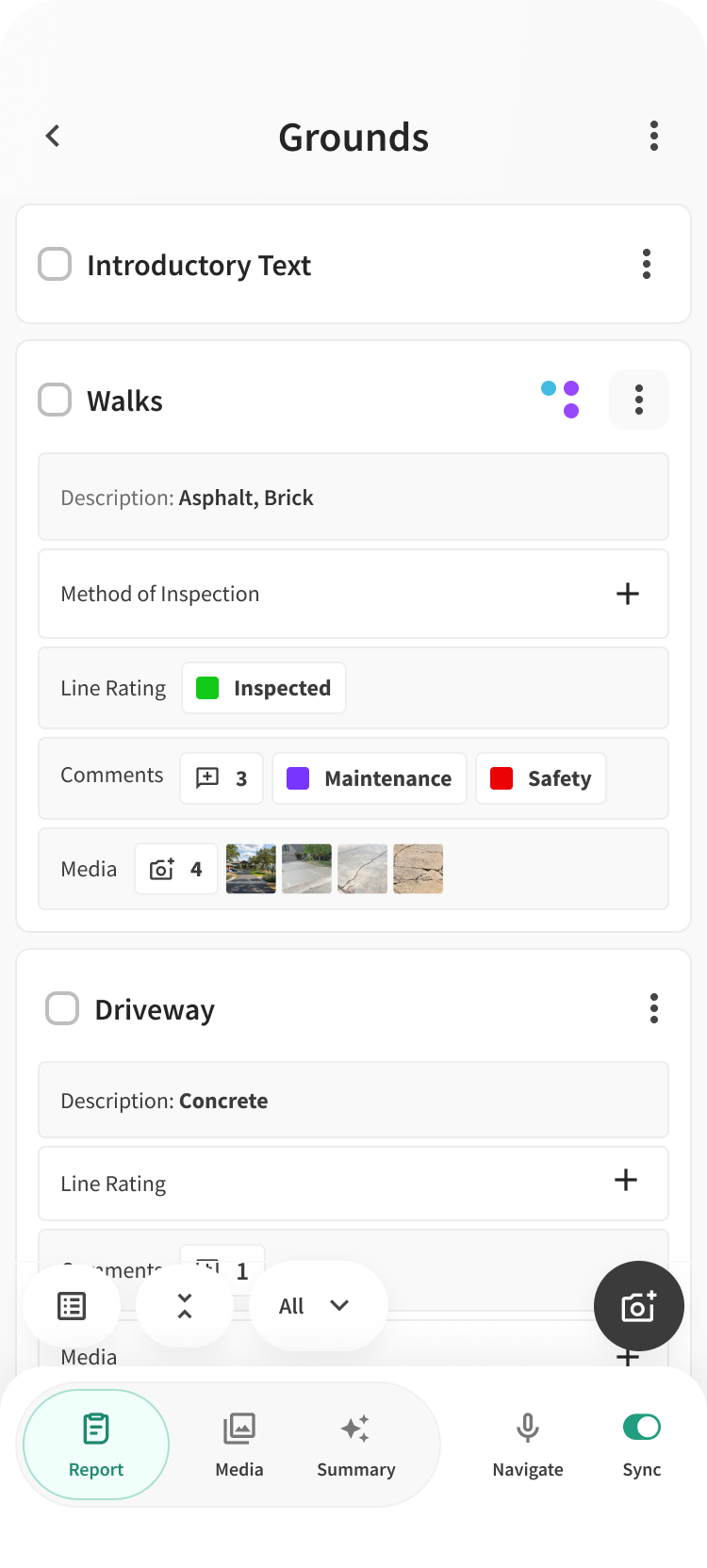
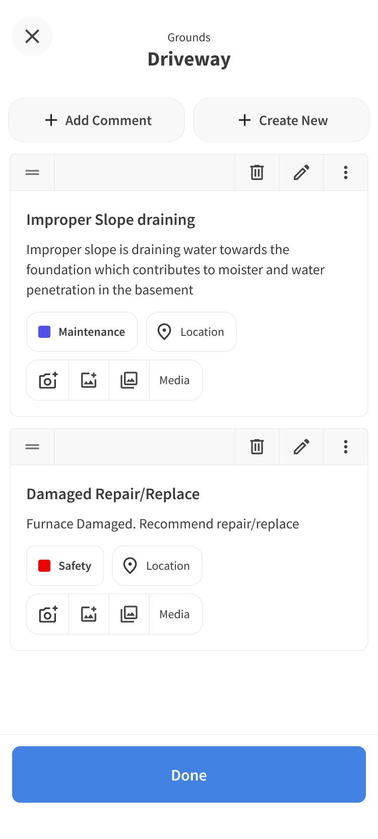
The prototype reproduced roughly 85% of the application’s behavior, including empty, populated, active, and completed states. It let the team evaluate system logic and visual execution together before committing implementation effort.

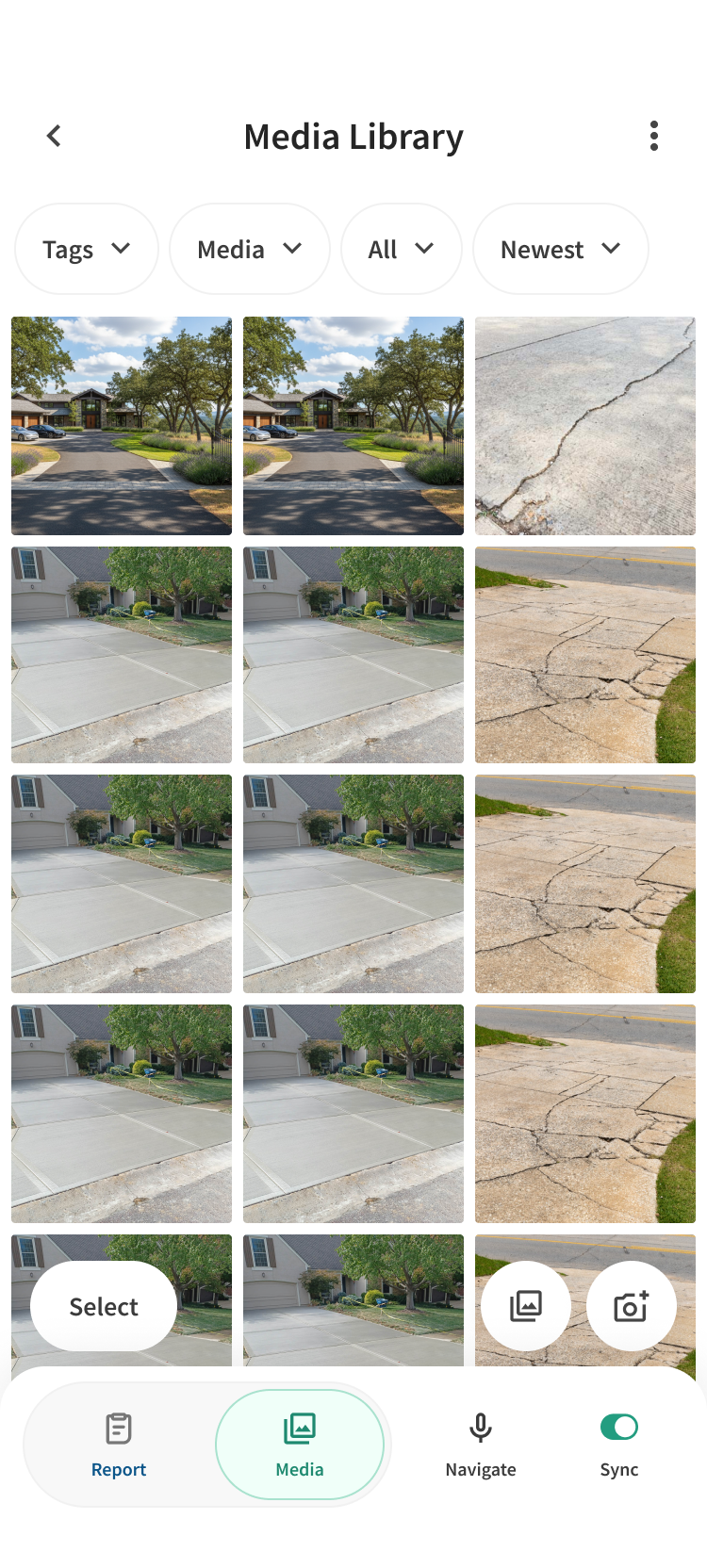
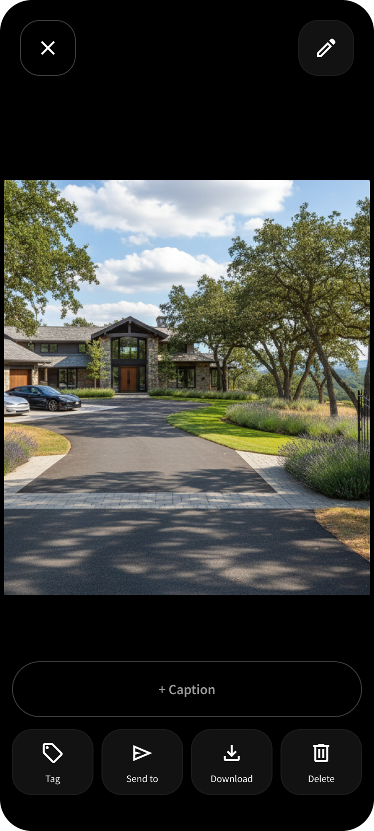
Palmtech grounds inspection checklist with ratings, comments, and media.Palmtech report comments for driveway findings with maintenance and safety tags.Palmtech media library grid with inspection photos and tag filters.Palmtech single photo view of a subject property during inspection.

Outcomes

What changed.

Settling behavior in the first month cut implementation waste. Engineering spent less time reworking screens and more time shipping a coherent platform.

~90%Delivery efficiency

Earlier alignment reduced rework, so development cost went into the product rather than into reconciling conflicting specs.

~85%Fewer production defects

A prototype close enough to React Native let the team catch feasibility issues before they reached QA.

1 monthOrganizational leverage

One executable direction replaced years of patch debt, giving product and engineering a shared system to build on.

Scheduling systems

A modernization that doesn’t make experienced users start over.

Input

I simplified the scheduling model, brought settings into the context where decisions happened, and preserved the familiar patterns that still served inspectors well.

Output

Timeline and agenda became two views of one event model, with settings inline where the scheduling decision happened.

Primary outcome
Less frictionWithout disruptive relearning.
AudienceInspection companies and teams
Core challengeModernize without forcing people to relearn
ContributionAdoption strategy · interaction model · system states · engineering handoff
OutcomeExisting teams kept their speed; new teams needed less training

Context / Problem

Why this mattered.

The calendar had accumulated controls and configuration away from the moments when users actually needed them. Yet scheduling is habitual work: changing everything at once would impose a learning cost on experienced customers who relied on the product every day.

CustomerRespect existing mental models

Frequent users had already built speed around familiar calendar behaviors.

ProductReduce navigation depth

Common scheduling decisions should not require leaving the event or calendar context.

SystemSupport multiple representations

Timeline and agenda views needed to feel like two views of the same scheduling model.

AdoptionImprove without disruption

Novelty was valuable only where it made a recurring task meaningfully clearer.

Process

The decisions behind the interface.

I treated the process as a series of product decisions—not a checklist of design activities. Each decision connected an input to a tension the team needed to resolve.

InputTensionDecision
01Users moved between calendar events and separate settings areas.Centralized settings were orderly, but removed from the task context.Bring relevant controls inline with the event or scheduling action.
02Different customers preferred visual timeline and compact agenda views.Independent views could develop inconsistent behavior.Use a shared event model with distinct presentations rather than separate workflows.
03The legacy interaction model was familiar but visually dense.A complete reset looked cleaner but raised adoption risk.Preserve stable mental models and modernize hierarchy, density, and contextual actions.

Solution

One scheduling model with clearer views and contextual controls.

The redesign simplified the calendar’s visual hierarchy, treated timeline and agenda as complementary views, and moved frequently used configuration closer to the event being created or edited.

Outcomes

What changed.

A clearer calendar that experienced schedulers still recognized protected adoption. Companies could modernize without a drop in daily throughput or a spike in support.

Less supportOne system to maintain

Timeline and agenda shared a model, which reduced duplicate workflows and the support cost of inconsistent behavior.

Faster bookingsTask completion

Controls at the point of decision shortened each booking and cut abandoned configuration.

Kept adoptionRetention

Useful learned behavior stayed intact, so modernization did not create churn or a relearning tax.

Design tooling

A prototype the whole team can inspect as a system.

Input

I built a review harness that generates a navigable schema from a functional prototype, so design review, QA, implementation, and handoff could happen against the same artifact.

Output

Review, QA, and engineering inspected the same prototype. Screens, states, and instances became visible instead of a curated demo, so one artifact served as review surface, QA tool, and handoff.

Primary outcome
Increased clarityReduced ambiguity and meeting durations by 50%
AudienceDesign, product, engineering, and QA
Core challengeReviews only showed the happy path
ContributionProduct design · review model · prototype tooling
OutcomeFewer review cycles, and fewer defects found after handoff

Context / Problem

Why this mattered.

Traditional review jumped between screenshots, prototypes, tickets, and production. The team already had interactive product direction, but no deterministic way to inspect every screen, state, and instance inside it. Empty states, alternate instances, and responsive differences were easy to overlook.

ProductStart from working prototypes

The team already had interactive direction; the gap was inspectability, not another set of screens.

ReviewCounter happy-path bias

Walking through the happy path could hide empty states, edge cases, and device-specific failures.

TeamShare one review surface

Design, product, engineering, and QA needed to inspect the same product direction without separate artifacts.

MaintenanceKeep documentation from going stale

Manual maps of screens and states would drift as soon as the prototype changed.

Process

The decisions behind the interface.

I treated the process as a series of product decisions—not a checklist of design activities. Each decision connected an input to a tension the team needed to resolve.

InputTensionDecision
01The prototype contained many screens, states, and instances.Manual documentation became stale as the prototype evolved.Generate a navigable schema from the functional prototype.
02Reviewers typically saw populated, successful data.Demo-only states hid setup, emptiness, and failure conditions.Let reviewers toggle between empty and pre-populated states.
03The same flows needed to work on mobile and tablet.A design that worked at one size could fail at another.Keep parallel instances available so responsive differences stayed visible.

Solution

A design harness that follows the product instead of sitting beside it.

The system combines prototype navigation, state inspection, production comparison, and responsive review. Auto-generated schemas update as the prototype evolves, giving the product an inspectable structure rather than only the happy path.

Outcomes

What changed.

Once the prototype could be inspected like a product, meetings got shorter and escaped issues dropped. Design, QA, and engineering worked from the same artifact instead of reconciling separate ones.

Fewer defectsQuality coverage

Reviewers caught empty, failure, and responsive states before they reached production, reducing escaped defects.

Less reworkFaster implementation

A single behavior reference cut back-and-forth between design and engineering.

50% less timeShorter meetings

Shared inspection replaced slide reviews, which halved meeting time and reduced handoff ambiguity.

Mobile conventions

A compressed mobile form that keeps the full order in context.

Input

I designed a reusable mobile pattern that combines inputs, expandable sections, and summary states so inspectors can scan a full order and edit nested information without getting lost.

Output

Input, expansion, summary, and nested editing became one mobile convention. Inspectors could see the whole order, find missing information, and edit a section without leaving context—later shipped in ISN’s field app.

Primary outcome
5x faster completionCompounding time savings
AudienceHome inspectors in the field
Core challengeComplex order data on a small screen
ContributionInteraction design · mobile patterns · information hierarchy
OutcomeMore orders finished on-site, with fewer callbacks for missing details

Context / Problem

Why this mattered.

A conventional mobile form can make complex information manageable one screen at a time, but the user loses the surrounding order and spends more time navigating. Property, client, notes, packages, scheduling, and fee information all belong to the same order, yet breadcrumbs and back-stack navigation made it hard to see what was complete and what was missing.

InputKeep a complex order intact

Property, client, notes, packages, scheduling, and fees needed to remain one order rather than a sequence of disconnected screens.

EnvironmentWork in the field

The interaction had to stay usable while an inspector was moving through a job, often one-handed.

Existing patternReplace breadcrumb navigation

Nested screens preserved detail but consumed attention and hid overall progress.

OrientationPreserve parent context

The summary view needed to remain the user’s map, not disappear whenever a child value was edited.

Process

The decisions behind the interface.

I treated the process as a series of product decisions—not a checklist of design activities. Each decision connected an input to a tension the team needed to resolve.

InputTensionDecision
01Orders contained many child inputs across several categories.Flattening everything created a long, difficult scan.Use top-level categories as parent inputs with nested children.
02Users needed to know what was complete without opening every section.Progress was invisible unless the user drilled into each category.Roll completed child values into compact parent summaries.
03Deep editing still required access to nested fields.Breadcrumbs and repeated back actions consumed attention.Use nested bottom sheets so users could edit without abandoning the order summary.

Solution

A summary-first order that expands only when the user needs detail.

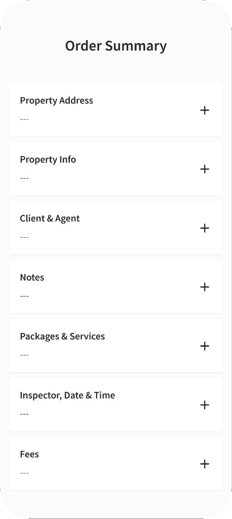
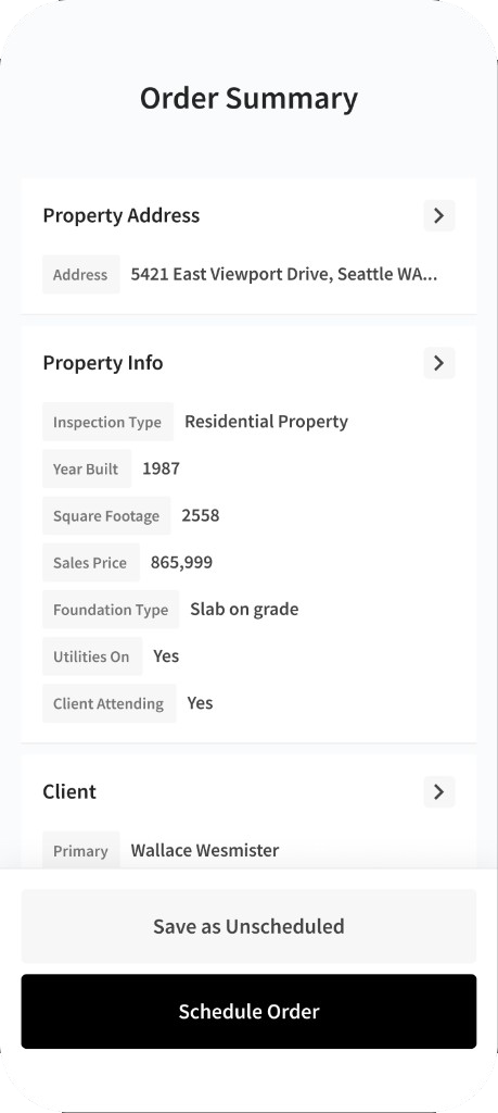
Empty states show what still needs attention; completed child values roll upward; nested sheets let users edit without leaving the order. The full order stays scannable while detail appears only where it is needed.

Empty order summary with collapsed sections so the full order stays scannable.Populated order summary with property, client, and scheduling details in collapsed rows.

Outcomes

What changed.

Keeping the full order in view made field entry faster and more complete. That saved inspector time and reduced the office work of chasing incomplete jobs.

Build oncePlatform leverage

One convention for input, summary, and nested edit could be reused, so later flows did not need a new interaction model.

Fewer callbacksComplete jobs

Inspectors could see what was missing and fix it in place, which cut callbacks and support follow-up.

At scaleField productivity

The pattern reached thousands of inspectors in ISN’s app, compounding time saved on every order created in the field.